Correlation of the two levels: 0.93Butter prices can appear related to the S&P 500
Python
Backtesting
Tutorial
Code
Two unrelated simulated price series have a correlation of 0.93 because both trend upward, and a cointegration test finds no evidence of a stable relation.

The correlation of two series is a number between −1 and 1 that measures how closely they move together. A high correlation between butter prices and the stock market can suggest that the two are related, although two unrelated series that trend upward can also appear highly correlated.
Whether two prices move together from month to month is a question about their monthly changes. Whether their levels keep a stable relationship over the years is a different question, and a cointegration test addresses the second question. I simulate a butter price and an S&P 500 that are unrelated but both drift upward: their levels have a correlation of 0.93, and a cointegration test finds no evidence of a stable relation between them.
Simulating the data
Both series are simulated. I build a “butter price” and an “S&P 500”, each of which adds a fixed drift and fresh noise every month,
\[B_t = B_{t-1} + 0.10 + \varepsilon_t, \qquad S_t = S_{t-1} + 0.30 + \eta_t,\]
where \(B_t\) is the butter price in month \(t\), starting at 50, and \(S_t\) the S&P 500, starting at 100. The noise terms \(\varepsilon_t\) and \(\eta_t\) are draws from bell-shaped normal distributions with mean zero and standard deviations, how far values typically are from their mean, of 1 and 2, independent across the 600 months and of each other. Adding up the steps gives \(B_t = 50 + 0.10\,t + \sum_{s=1}^{t} \varepsilon_s\): the drift adds 0.10 a month, and the accumulated noise has a standard deviation of \(\sqrt{t}\), which grows with time, so each level wanders upward. The series take only their names from real butter prices and the S&P 500, and their starting levels, drifts and standard deviations are assumptions. They are unrelated by construction, so any relationship the tests report is spurious.
NoteCode: the two series
import numpy as np
import matplotlib.pyplot as plt

SEED   = 6      # one fixed draw, so the post reproduces the same numbers every time
MONTHS = 600

random_generator = np.random.default_rng(SEED)

# Each series is a random walk with drift. Every month it takes a step, and the step is a
# fixed drift plus that month's own noise. cumsum adds the steps up, so the level wanders
# upward. The two sets of steps are drawn separately, so nothing connects them.
butter_steps = 0.10 + random_generator.normal(0, 1.0, MONTHS)   # small drift, small noise
sp500_steps  = 0.30 + random_generator.normal(0, 2.0, MONTHS)   # larger drift, larger noise

butter = 50  + np.cumsum(butter_steps)     # base 50, plus the accumulated steps
sp500  = 100 + np.cumsum(sp500_steps)      # base 100, plus the accumulated steps

# corrcoef returns a 2x2 table of every pair, so the number wanted is off the diagonal
correlation = np.corrcoef(butter, sp500)[0, 1]
print(f"Correlation of the two levels: {correlation:.2f}")The chart below draws both series over the 600 months. The two series have very different scales, so each has its own: the butter price on the left and the S&P 500 on the right.
NoteCode: the chart
RED, TEAL, ORANGE, GREY = "#C0392B", "#17868A", "#D2822B", "#888888"
# The site's chart colours: a cream background, a light grid and a pale frame, so every chart
# on the site has the same look.
BG, INK, GRID, SPINE, AXIS_TEXT = "#FCEFE3", "#1f1f1f", "#EADCCC", "#D5C6B4", "#4a4a4a"


def style_chart(figure, axis):
    """Give a finished chart the site's cream background, light grid and pale frame."""
    figure.patch.set_facecolor(BG)
    axis.set_facecolor(BG)
    axis.grid(True, axis="y", color=GRID, lw=1.0)
    axis.set_axisbelow(True)
    for side in ("top", "right"):
        axis.spines[side].set_visible(False)
    for side in ("left", "bottom"):
        axis.spines[side].set_color(SPINE)
    axis.tick_params(axis="both", length=0, colors=INK, pad=6)
    axis.xaxis.label.set_color(AXIS_TEXT)
    axis.yaxis.label.set_color(AXIS_TEXT)
    axis.title.set_color(INK)
    # Each legend entry in the colour of what it labels: a line's colour or a bar's fill.
    # get_legend() returns None when the chart has no legend.
    legend = axis.get_legend()
    if legend is not None:
        for text, handle in zip(legend.get_texts(), legend.legend_handles):
            if hasattr(handle, "get_color"):
                text.set_color(handle.get_color())
            else:
                text.set_color(handle.get_facecolor())


fig, butter_axis = plt.subplots(figsize=(9, 5))
butter_axis.plot(butter, color=ORANGE, lw=1.5)
butter_axis.set_xlabel("month")

sp500_axis = butter_axis.twinx()                       # a second y-axis on the same x-axis
sp500_axis.plot(sp500, color=TEAL, lw=1.5)

plt.title("Butter and the S&P 500, both drifting up (simulated, unrelated)")
style_chart(fig, butter_axis)

# style_chart styles the left axis. The right axis keeps only its own frame line on the right,
# and each y label takes the colour of its line, so the labels say which line is which.
for side in ("top", "left", "bottom"):
    sp500_axis.spines[side].set_visible(False)
sp500_axis.spines["right"].set_color(SPINE)
sp500_axis.tick_params(axis="y", length=0, colors=INK, pad=6)
sp500_axis.title.set_color(INK)
butter_axis.set_ylabel("butter price", color=ORANGE)
sp500_axis.set_ylabel("S&P 500", color=TEAL)

fig.tight_layout()
plt.savefig("nr44_butter_spx.png", dpi=120, bbox_inches="tight", facecolor=BG)
plt.show()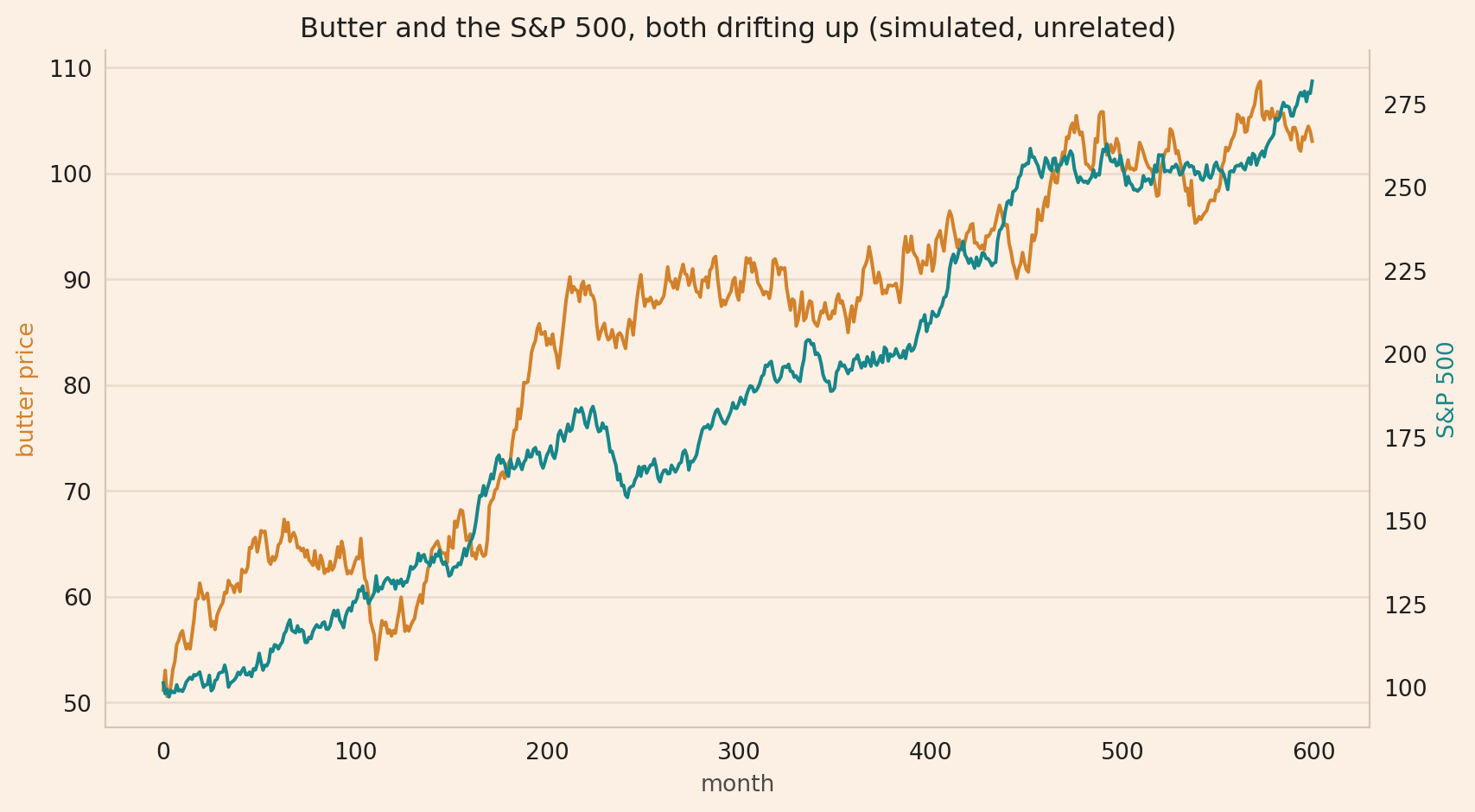
The orange butter price line and the teal S&P 500 line both increase over the 600 months, and their correlation is 0.93. The correlation compares each series with its own average over the 600 months. Both series tend to be below their averages early and above them late, so their common upward trend produces a high correlation even though their monthly changes are independent. On this evidence alone, butter prices appear related to the S&P 500.
Regressing the S&P 500 on butter prices
A regression fits a straight line through the monthly pairs of levels,
\[S_t = a + b\,B_t + e_t,\]
where \(S_t\) is the simulated S&P 500 in month \(t\), \(B_t\) the butter price, \(a + b\,B_t\) the fitted level and \(e_t\) the residual, the part of the S&P 500 that the line does not fit. With \(a = 10\) and \(b = 3\), for example, a butter price of 50 gives a fitted level of 160, and an S&P 500 of 164 leaves a residual of 4. The block below fits the line by least squares and reports the R-squared, the share of the variation in the S&P 500 that the line fits, and the usual test of whether the slope \(b\) differs from zero. Its t-statistic is \(b\) divided by \(b\)’s standard error, which the usual formula computes assuming that the residuals are independent noise around a stable average, and its p-value is the chance of a t-statistic at least that large if the true slope were zero and that assumption held.
NoteCode: the regression
import statsmodels.api as sm

# add_constant puts a column of ones beside butter, so the line being fitted has an
# intercept as well as a slope. Without it the line would be forced through zero.
regression = sm.OLS(sp500, sm.add_constant(butter)).fit()

# The fit returns one number per column, in the order the columns were given. Position 0
# is the intercept and position 1 is butter, which is the one being tested.
butter_t_statistic = regression.tvalues[1]
butter_p_value = regression.pvalues[1]

print(f"R-squared:    {regression.rsquared:.2f}    "
      f"(the regression fits {regression.rsquared:.0%} of the variation in the S&P 500)")
print(f"t-statistic:  {butter_t_statistic:.0f}     (past about 2 counts as significant)")
print(f"p-value:      {butter_p_value:.0e}   (looks highly significant here)")
R-squared: 0.87 (the regression fits 87% of the variation in the S&P 500)
t-statistic: 63 (past about 2 counts as significant)
p-value: 9e-267 (looks highly significant here)The regression gives an R-squared of 0.87, a t-statistic of 63 and a p-value below 0.001. By the textbook, butter prices are strongly related to the S&P 500. The relation is spurious: the two series are unrelated, and both trend upward.
The t-statistic is only meaningful when the residual behaves like noise around a stable average. Here the residual wanders as the two series do, so the regression measures the upward drift of both series. Granger and Newbold named a regression between unrelated trending series a spurious regression in 1974.
What cointegration requires
A stationary series has a constant mean and variance, the square of the standard deviation: it moves around a fixed level, and its moves do not grow over time. A non-stationary series has a mean or variance that shifts over time. A price level is usually non-stationary: it can trend upward for long periods, so its average today can be far above its average years ago.
The regression reports a strong relation because both series are non-stationary. A cointegration test requires both series to be non-stationary, both integrated of the same order, and a sample long enough to estimate the relation. A series that is non-stationary in levels and stationary after one difference, the change from one period to the next, is integrated of order one, written I(1). The butter price is I(1) by construction: its first difference, \(B_t - B_{t-1} = 0.10 + \varepsilon_t\), is a constant plus fresh noise. The next block tests both properties for each series with the Augmented Dickey-Fuller (ADF) test, which fits
\[\Delta y_t = \alpha + \gamma\,y_{t-1} + \dots + u_t,\]
where \(\Delta y_t\) is the series’ change in month \(t\), \(y_{t-1}\) its level the month before, the dots are terms in past changes, and \(u_t\) is noise. With \(\gamma = 0\) the change does not depend on the level, so each shock stays in the level for good and the series wanders: it has a unit root. With \(\gamma < 0\) a high level tends to be followed by a decrease, which pulls the series back toward a fixed level. The test’s null hypothesis, the claim the test tries to reject, is a unit root, and a p-value below 0.05 is evidence against a unit root.
NoteCode: the ADF tests
from statsmodels.tsa.stattools import adfuller

def adf_pvalue(series):
    """The p-value of the Augmented Dickey-Fuller test on one series.

    The test asks whether the series has a unit root, meaning it wanders instead of
    returning to a fixed level. A low p-value, below 0.05, is evidence against a unit
    root. A high p-value only means the test could not rule a unit root out, which is not
    the same as proving there is one.
    """
    result = adfuller(series, autolag="AIC")
    return result[1]                  # adfuller returns several numbers; the p-value is the second

# np.diff subtracts each month from the next, giving the absolute change in the level.
# That is a first difference, in price units. A percentage return divides instead of subtracting.
butter_changes = np.diff(butter)
sp500_changes  = np.diff(sp500)

print("                  levels    first difference")
print(f"butter  ADF p:    {adf_pvalue(butter):.2f}      {adf_pvalue(butter_changes):.0e}")
print(f"S&P 500 ADF p:    {adf_pvalue(sp500):.2f}      {adf_pvalue(sp500_changes):.0e}")

print("\nHigh in levels, about zero in differences: both series behave as I(1).")
levels first difference
butter ADF p: 0.57 1e-17
S&P 500 ADF p: 0.94 0e+00
High in levels, about zero in differences: both series behave as I(1).In levels the test cannot rule out a unit root, with p-values of 0.57 and 0.94, so neither series can be called stationary. For the month-to-month first differences the p-values are near zero, which is evidence that the differences are stationary. So both series behave as I(1), as they were built to, which is the setup cointegration needs.
Testing for cointegration
Cointegration asks whether the residual of the regression line, the spread \(e_t = S_t - a - b\,B_t\), is stationary even though each series alone is not. A stationary spread returns toward its average when the two series move apart. A spread that does not return means there is no stable long-run relationship.
I use the Engle-Granger test: regress the S&P 500 on the butter price, then test whether the spread is stationary. The intercept and slope are estimated from the same data to make the spread’s variance as small as possible, which biases an ordinary unit-root test toward finding a stationary spread, so coint() computes stricter p-values that allow for that estimation. The null hypothesis is that the spread is non-stationary, so the two series are not cointegrated, and a p-value below 0.05 is evidence of cointegration.
NoteCode: the cointegration test
from statsmodels.tsa.stattools import coint

# The Engle-Granger test: regress one series on the other, then ask whether what is left
# over, the spread, is stationary.
result = coint(sp500, butter)
cointegration_p_value = result[1]     # coint returns three things; the p-value is the second

print(f"Cointegration p-value: {cointegration_p_value:.2f}"
      f"    (low = evidence of cointegration; high = no evidence of cointegration)")
Cointegration p-value: 0.45 (low = evidence of cointegration; high = no evidence of cointegration)The cointegration test gives a p-value of 0.45, too high to reject the null hypothesis at the 5% level. So, I find no evidence of a stationary spread. In truth the two series are not cointegrated, because I simulated them independently.
Conclusion
To ask whether these simulated series move together from month to month, compare their monthly changes. To ask whether their levels share a stable long-run relationship, test whether their spread is stationary, as the cointegration test does.
Start with the economics. Ask whether there is any reason these two series should be related, because no test supplies that reason, and every test will sometimes report a relationship where there is none. Then, if we want to know whether two non-stationary series share a stable long-run relation, a cointegration test is designed for that question.
The takeaway is that a high correlation between two upward-trending prices can come from the trends alone, as the 0.93 between these unrelated series does, and a cointegration test asks whether their levels keep a stable relation.
Sources: Granger, C. W. J. and Newbold, P. (1974), Spurious regressions in econometrics, Journal of Econometrics.
Disclaimer: a teaching example on simulated data. Not investment advice.