IPO boom = market top? The data says otherwise
An IPO boom as a market top? The data says otherwise. A busy year for US initial public offerings (IPOs) did not precede a weak year for the S&P 500. The belief is that an IPO boom marks a top, and 2000 and 2021 are the examples people point to: companies rush to sell shares when prices are high, so a flood of new listings should give way to poor returns. Pastor and Veronesi (2003) find that IPO volume rises with recent market returns and forecasts a lower return the next quarter, a modest negative link through the cost of capital.
I test whether a high IPO count warned of a weak next year for the S&P 500 over the full 1988 to 2025 record. It did not. When IPO activity over the prior 12 months had been at least 3.0% of listed US firms, the S&P 500 total return over the next 12 months came in 2.0 percentage points below its all-months average. At the most extreme threshold, 7.0%, the next-year return ran 3.5 points above average. The abnormal return stayed within a few points of zero and changed sign, so a high IPO count was not a stable warning.
The test
- Signal. IPO intensity is the number of US IPOs over the prior 12 months, divided by the number of listed US firms, as a percent. Deflating by the firm count follows Pastor and Veronesi (2003) and keeps the 1990s comparable to today.
- Universe. Approximate operating-company IPOs on major US exchanges: common shares, an offer price of at least $5, no special-purpose acquisition companies and no business development companies. This keeps 8,117 of 17,584 raw deals.
- Thresholds. Nested cut-offs from 1.0% to 7.0% of listed firms. Each keeps the months where intensity had been at least that high, as long as at least 12 such months exist.
- Outcome. The S&P 500 total return over the next 12 months, averaged across the qualifying months, less the all-months average.
- Sample. Signal months from January 1988 to June 2025, so the last forward return ends in mid-2026.
Starting point
The test runs off two files: monthly IPO counts built from an LSEG deal list, and the S&P 500 total-return index. Building them is a separate job that depends on the data vendor. I pull from LSEG Workspace. Because the data is licensed, the raw files stay off this page, and I show the code without running it here. The listed-firm deflator is the World Bank count of domestically listed companies, which is public.
Step 1. The signal
Each month-end I count the IPOs over the prior 12 months, divide by the number of listed US firms, and pair that with the S&P 500 total return over the next 12 months.
ipo12  = cnt.reindex(mo.index).fillna(0).rolling(12).sum()   # IPOs in the prior 12 months
signal = ipo12 / firms * 100                                 # as a % of listed US firms
fwd    = mo.shift(-12) / mo - 1                              # S&P 500 total return over the next 12 months
panel  = pd.DataFrame({"sig": signal, "fwd": fwd}).dropna()
Here cnt is the monthly IPO count, mo is the month-end total-return index, and firms is the listed-firm count held flat and lagged one month, so the signal uses only information known at the time. The current reading tells me how busy the IPO market is today.
latest = signal.dropna()
print(f"latest IPO activity = {latest.iloc[-1]:.1f}% (as of {latest.index[-1]:%b %Y})")
latest IPO activity = 2.7% (as of May 2026)IPO intensity today is 2.7%, near the middle of the historical range.
Step 2. The abnormal return at each threshold
For each threshold I take the months where intensity had been at least that high, average their next-12-month S&P 500 return, and subtract the average across all months. That difference is the abnormal return: how the market did after that much IPO activity, relative to a normal year.
df   = panel[(panel.index.year >= 1988) & (panel.index.year <= 2025)]
allm = df["fwd"].mean() * 100                                    # the benchmark: all-months average next-12m return
xs   = [X for X in THRESHOLDS if (df["sig"] >= X).sum() >= 12]   # thresholds with at least 12 qualifying months
abn  = [df[df["sig"] >= X]["fwd"].mean() * 100 - allm for X in xs]   # conditional average, less the benchmark
The printed abnormal return at each threshold, with the number of qualifying months:
threshold   months   abnormal return
   1.0%      419         -0.9%
   1.5%      400         -1.0%
   2.0%      340         -0.7%
   2.5%      309         -1.2%
   3.0%      260         -2.0%
   3.5%      204         -1.8%
   4.0%      157         -0.6%
   4.5%      124         -1.0%
   5.0%      112         -0.6%
   5.5%       96         -0.6%
   6.0%       69         -1.3%
   6.5%       48         +0.8%
   7.0%       33         +3.5%
Every threshold sat within a few points of zero. The deepest shortfall was 2.0 points at the 3.0% cut-off, across 260 months. The two most extreme thresholds ran the other way: 6.5% was 0.8 points above average, and 7.0% was 3.5 points above, across only 48 and 33 months. So, in this sample IPO frequency was not a stable warning of a weak next year.
Step 3. The chart
fig, ax = plt.subplots(figsize=(9.2, 6.2))
ax.axhline(0, color="#888", lw=1.0)                          # a normal year
ax.plot(xs, abn, "-o", color="#d62728", lw=1.9, ms=6.5)     # abnormal return at each threshold
ax.axvline(today_val, color="#1a1a1a", ls="--", lw=1.2)     # where today's IPO intensity sits
ax.set_xlabel("IPO intensity threshold (% of US firms in prior 12 months)")
ax.set_ylabel("Next-12-month S&P 500 abnormal return (%)")
ax.set_title("An IPO boom = a market top?")
plt.savefig("post_ipo_rate_threshold_1988.png", dpi=450, bbox_inches="tight")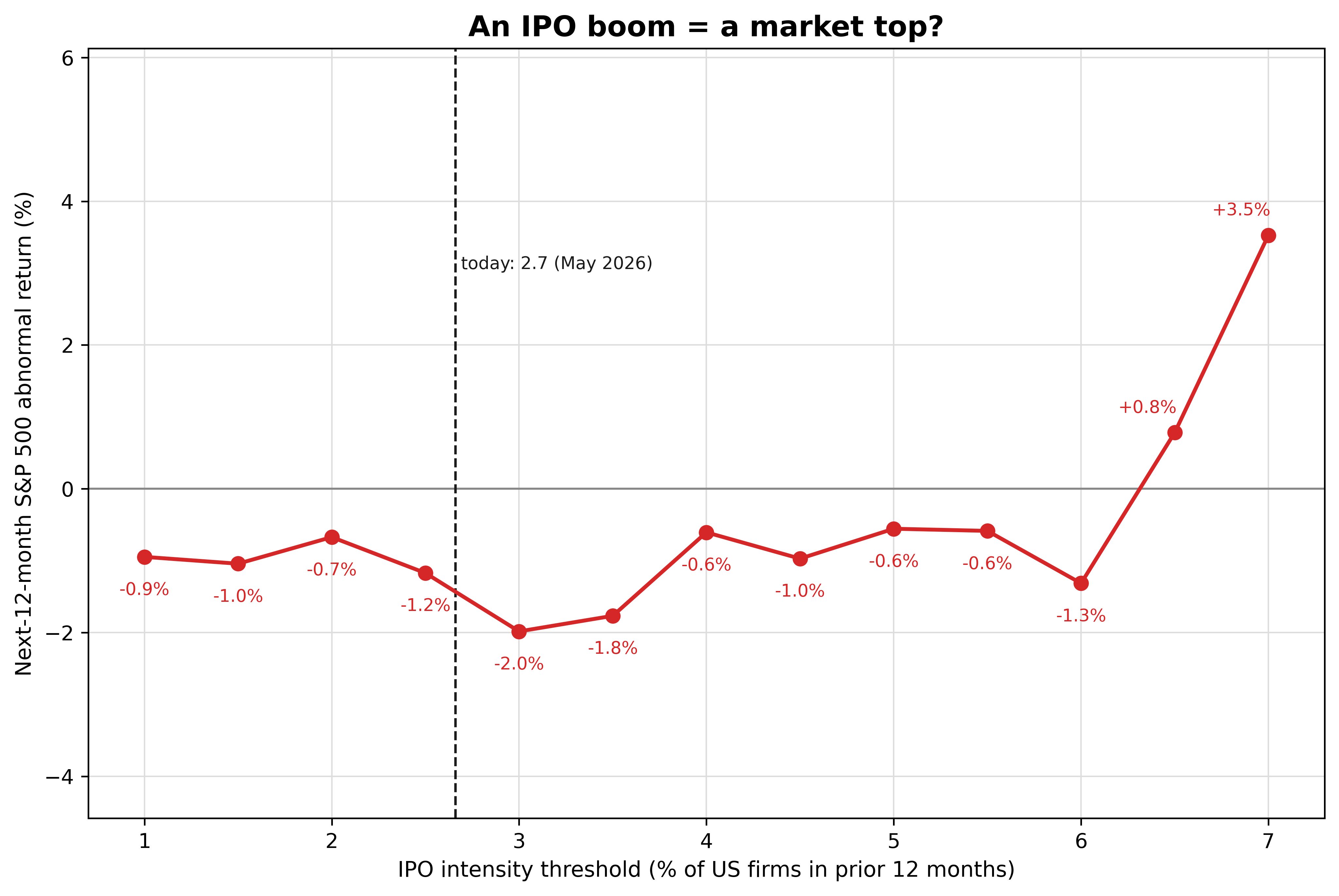
The red line hugs the zero line across the whole range and lifts above it at the extreme right. The dashed line marks today’s 2.7%, which sits well inside the range.
Step 4. Which years drive the extremes
The high thresholds rest on a handful of months. Restricting to the 2000-onward window, I check which years supply them.
dfx = panel[(panel.index.year >= 2000) & (panel.index.year <= 2025)]   # the 2000-onward sample
for X in (6, 6.5, 7):
    yrs = dfx[dfx["sig"] >= X].index.year.value_counts().sort_index()   # qualifying months, by year
    print(f">= {X}%: " + ", ".join(f"{y}: {n} months" for y, n in yrs.items()))
>= 6.0%: 2000: 9 months, 2021: 7 months
>= 6.5%: 2000: 5 months, 2021: 7 months
>= 7.0%: 2000: 2 months, 2021: 4 monthsThe most extreme readings come from two periods, the 2000 dot-com peak and the 2021 listing wave. The years after both booms were weak, yet across the full record those cases do not pull the line into a clear warning. Restrict the sample to 2000 onward and the line slopes down instead, which is why the signal is descriptive.
What this test does not settle
Overlapping windows and nested thresholds. The 12-month forward returns of adjacent months share 11 of their 12 months, and each threshold is a subset of the one below it. The months are therefore not independent draws, so I do not attach confidence intervals to any point. Read the shape of the line and do not lean on any single point.
The sign flips across sub-periods. On the full 1988 to 2025 record the line stays near zero. Start it in 2000 and it slopes down, because the extreme readings concentrate in the 2000 and 2021 booms. A relationship that changes sign with the window is what “not a stable signal” means.
An approximate IPO universe. I assign months by LSEG issue date, and the operating-company filter is an approximation. Against Ritter’s net IPO count over 1988 to 2025, the monthly series correlates at 0.973 and totals 1.073 times his count, with a mean absolute monthly gap of 2.9 IPOs. The levels are close enough for a percent-of-firms signal.
A different method from Pastor-Veronesi. They ran quarterly multivariate regressions on the next quarter’s return over 1960 to 2002 and found a modest negative link. This is a plain threshold test on the next year over a modern, longer sample. It is a reassessment at a different horizon, so it neither reproduces nor refutes their result.
What it means
Over the 1988 to 2025 record, higher IPO intensity did not precede weaker next-year S&P 500 returns. The abnormal return stayed within a few points of zero at every threshold, reached its largest shortfall of 2.0 points at 3.0% of listed firms, and turned positive at the two most extreme cut-offs. The high readings trace back to the 2000 and 2021 booms, and once I cut the sample to those years the line changes sign. Selling out because IPOs are booming assumes the IPO count carries information about next year’s market return, and over this sample it did not. The takeaway is that a busy IPO year was not a reliable warning of a weak stock-market year, because the relationship is near zero and flips sign across periods.
Read next
- Expensive IPOs are a free lunch for about a day The other IPO study: what debut size and valuation say about returns.
- Download Every US IPO from LSEG in Python The pipeline that built the IPO counts behind this post.
Disclaimer: this is a simplified, descriptive historical test for discussion purposes only. Not investment advice. Past performance does not predict future returns.
Data: US IPO deal records and the S&P 500 total-return index from LSEG Workspace (licensed); listed-firm counts from the World Bank and the validation count from Jay Ritter. Because the LSEG data is licensed, I do not reproduce the raw file here.