Six biases that distort quant research, measured where the truth is known
Python
Tutorial
Code
Five of the six biases make a worthless result look valuable, and one makes a good strategy look bad.
Published
July 26, 2026
Source: Image by author using ChatGPT
Rolf Dobelli’s The Art of Thinking Clearly describes survivorship bias, the error of studying only the survivors, and reading it made me look for more biases like it in quantitative research. Code computes a quantitative result, but we choose the hypothesis, the data, the tests and how to read the evidence, so the result depends on judgements that the code cannot check.
In real data we rarely learn what the truth was, so we cannot measure how large a bias is. I therefore simulate six small markets where I fix the truth in advance, create one bias in each, and measure how far the result differs from the truth. The sizes, volatilities and counts in these markets are assumptions.
The first two biases come from the data: stocks missing from it, and trends in it. The next three come from searching for a result: adjusting one strategy, picking the best of many versions, and ranking managers on a lucky record. The first five biases make a worthless result look valuable. The sixth does the opposite: it throws away a strategy that should be kept. Each section ends with a safeguard.
Show the setup code
import numpy as npimport matplotlib.pyplot as plt# One colour for the misleading number, one for the truth, one for the individual pathsRED ="#C0392B"TEAL ="#17868A"GREY ="#888888"# The site's chart colours: a cream background, a light grid and a pale frame, so every chart# on the site has the same look.BG, INK, GRID, SPINE, AXIS_TEXT ="#FCEFE3", "#1f1f1f", "#EADCCC", "#D5C6B4", "#4a4a4a"D =252# trading days in a yeardef style_chart(figure, axis):"""Give a finished chart the site's cream background, light grid and pale frame.""" figure.patch.set_facecolor(BG) axis.set_facecolor(BG) axis.grid(True, axis="y", color=GRID, lw=1.0) axis.set_axisbelow(True)for side in ("top", "right"): axis.spines[side].set_visible(False)for side in ("left", "bottom"): axis.spines[side].set_color(SPINE) axis.tick_params(axis="both", length=0, colors=INK, pad=6) axis.xaxis.label.set_color(AXIS_TEXT) axis.yaxis.label.set_color(AXIS_TEXT) axis.title.set_color(INK)# Each legend entry in the colour of what it labels: a line's colour or a bar's fill.# get_legend() returns None when the chart has no legend. legend = axis.get_legend()if legend isnotNone:for text, handle inzip(legend.get_texts(), legend.legend_handles):ifhasattr(handle, "get_color"): text.set_color(handle.get_color())else: text.set_color(handle.get_facecolor())def sharpe(daily_returns):"""The annual Sharpe ratio of a series of daily returns, with no risk-free rate. The average daily return is divided by the daily standard deviation, and the result is multiplied by the square root of the trading days in a year, which is how a daily ratio is converted to an annual ratio. """ returns = np.asarray(daily_returns) # so a list is accepted as well as an array average_return = returns.mean() return_volatility = returns.std(ddof=1) # ddof=1 is the sample standard deviationreturn average_return / return_volatility * np.sqrt(D)
1. Survivorship bias
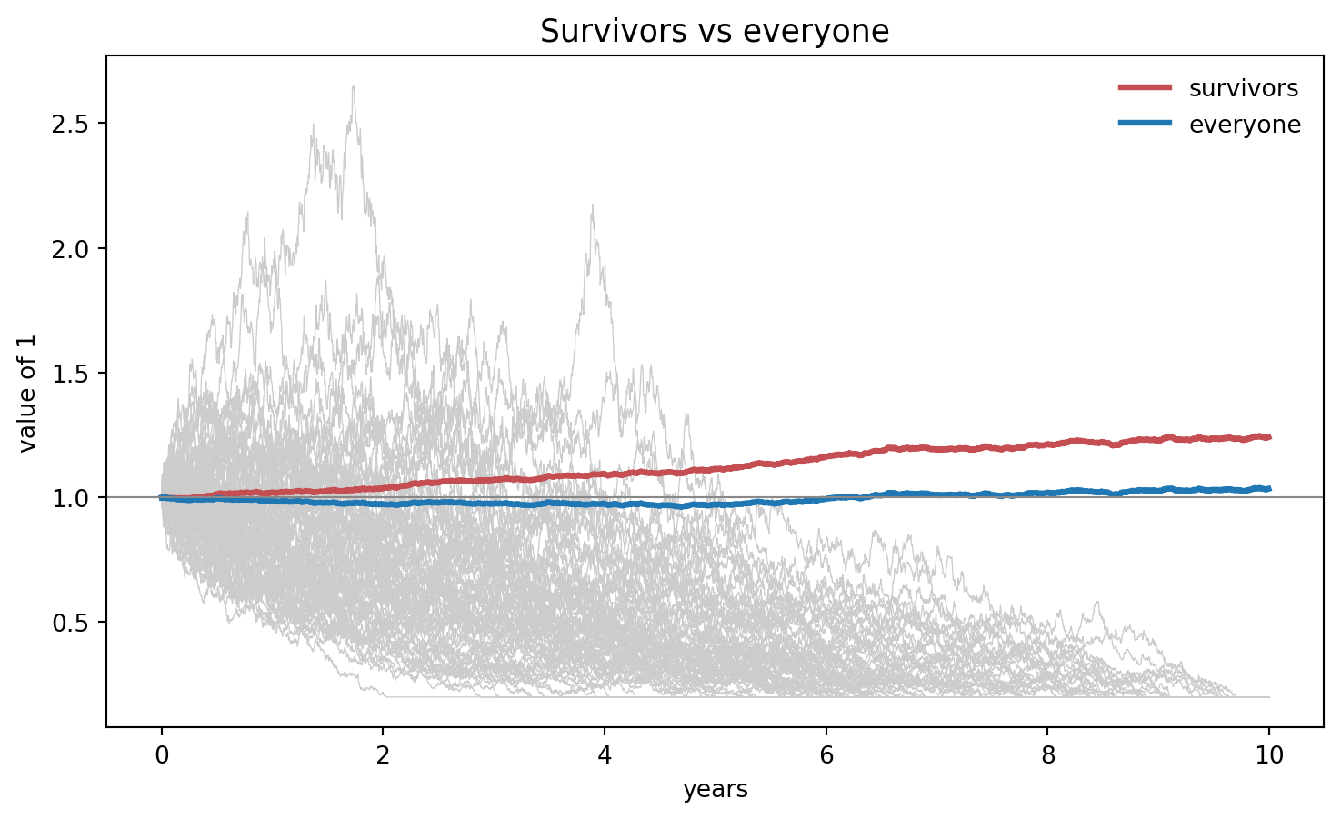
Say we have a thousand stocks whose daily returns are drawn with a mean of zero. Over ten years, about two hundred of them fall so far that they stop trading. If we now measure the average return of the stocks that are still listed, we get 2.2% a year.
So, the issue is that, not accounting for the stocks that stopped trading (survivorship bias), we falsely believe that the average return of the stocks is 2.2% a year. The average return of all 1,000 stocks is 0.3% a year.
Each stock’s value, starting from 1, multiplies its daily growth factors,
where \(V_{i,t}\) is the value of stock \(i\) after day \(t\), \(\prod\) multiplies the factors for days 1 to \(t\), and \(z_{i,s}\) is a draw from the standard normal distribution, independent across stocks and days. The standard normal distribution is bell-shaped with a mean of 0 and a standard deviation of 1, where the standard deviation measures how far values typically are from their mean. So each daily return has a mean of zero and a standard deviation of 2%. A stock stops trading on the first day its value is below 0.2, and its value stays at 0.2 from then on. An average value \(\bar V\) after ten years is an average yearly return of \(\bar V^{1/10} - 1\).
Show the code
rng = np.random.default_rng(1)NUMBER_OF_STOCKS =1000NUMBER_OF_DAYS =10* D # ten years of trading daysDAILY_VOLATILITY =0.02# the standard deviation of one day's returnDELISTING_LEVEL =0.20# the level at which a stock stops trading# Every stock gets one random move per day, drawn around an average of zero, so in truth# no stock has an edge. cumprod multiplies each column of daily moves together, which# turns them into the value of 1 invested in that stock at the start.daily_moves = rng.normal(0, DAILY_VOLATILITY, (NUMBER_OF_DAYS, NUMBER_OF_STOCKS))value_paths = np.cumprod(1+ daily_moves, axis=0) # one column per stock# True on every day a stock's value is below that levelbelow_level = value_paths < DELISTING_LEVELstopped_trading = below_level.any(axis=0) # one True or False for each stock# A stock that falls that far never trades again, so its value is held at the level from# the first day it reached it. argmax on a column of True and False returns the position# of the first True, because True counts as 1 and False as 0.for stock in np.where(stopped_trading)[0]: first_day_below = below_level[:, stock].argmax() value_paths[first_day_below:, stock] = DELISTING_LEVEL# ~ flips True and False, so this average covers only the stocks still listed at the endsurvivor_average = value_paths[:, ~stopped_trading].mean(axis=1)all_stocks_average = value_paths.mean(axis=1) # every stock, delisted ones included# Ten years of growth becomes an average yearly return by taking the tenth root, which is# the power 0.1, and then removing the 1 that was invested at the start.survivor_yearly = (survivor_average[-1] **0.1-1) *100all_stocks_yearly = (all_stocks_average[-1] **0.1-1) *100print(f"survivors {survivor_yearly:+.1f}% a year, "f"all stocks {all_stocks_yearly:+.1f}%, "f"{stopped_trading.sum()} of {NUMBER_OF_STOCKS} stopped trading")years = np.arange(NUMBER_OF_DAYS) / D # the x-axis in years rather than daysfig, ax = plt.subplots(figsize=(9, 5))for stock in np.where(stopped_trading)[0][:80]: # eighty of them, to keep the chart clear ax.plot(years, value_paths[:, stock], color=GREY, lw=0.5, alpha=0.4)ax.plot(years, survivor_average, color=RED, lw=2.4, label="survivors")ax.plot(years, all_stocks_average, color=TEAL, lw=2.4, label="all stocks")ax.axhline(1.0, color=GREY, lw=0.8)ax.set_xlabel("years")ax.set_ylabel("value of 1")ax.set_title("Survivors vs all stocks", fontsize=13)ax.legend(frameon=False)style_chart(fig, ax)plt.show()
survivors +2.2% a year, all stocks +0.3%, 199 of 1000 stopped trading
The teal line is the average value of all 1,000 stocks, including the ones that stopped trading. The grey lines are eighty of the stocks that stopped trading along the way. The red line is the average value of the stocks still listed at the end. The gap between the red line and the teal line is the survivorship bias: the stocks still listed return 2.2% a year, and all 1,000 stocks 0.3% a year.
Safeguard. Check that the data include the stocks that stopped trading, for example through a vendor’s delisting flag or list of delisted stocks. Without one, look at the worst cumulative return: over ten years, a thousand stocks should include some that lost nearly everything, so a worst cumulative return of about -20% suggests that the stocks that stopped trading are missing.
2. Spurious correlation
The first bias came from data that went missing. The next one comes from data where everything is present.
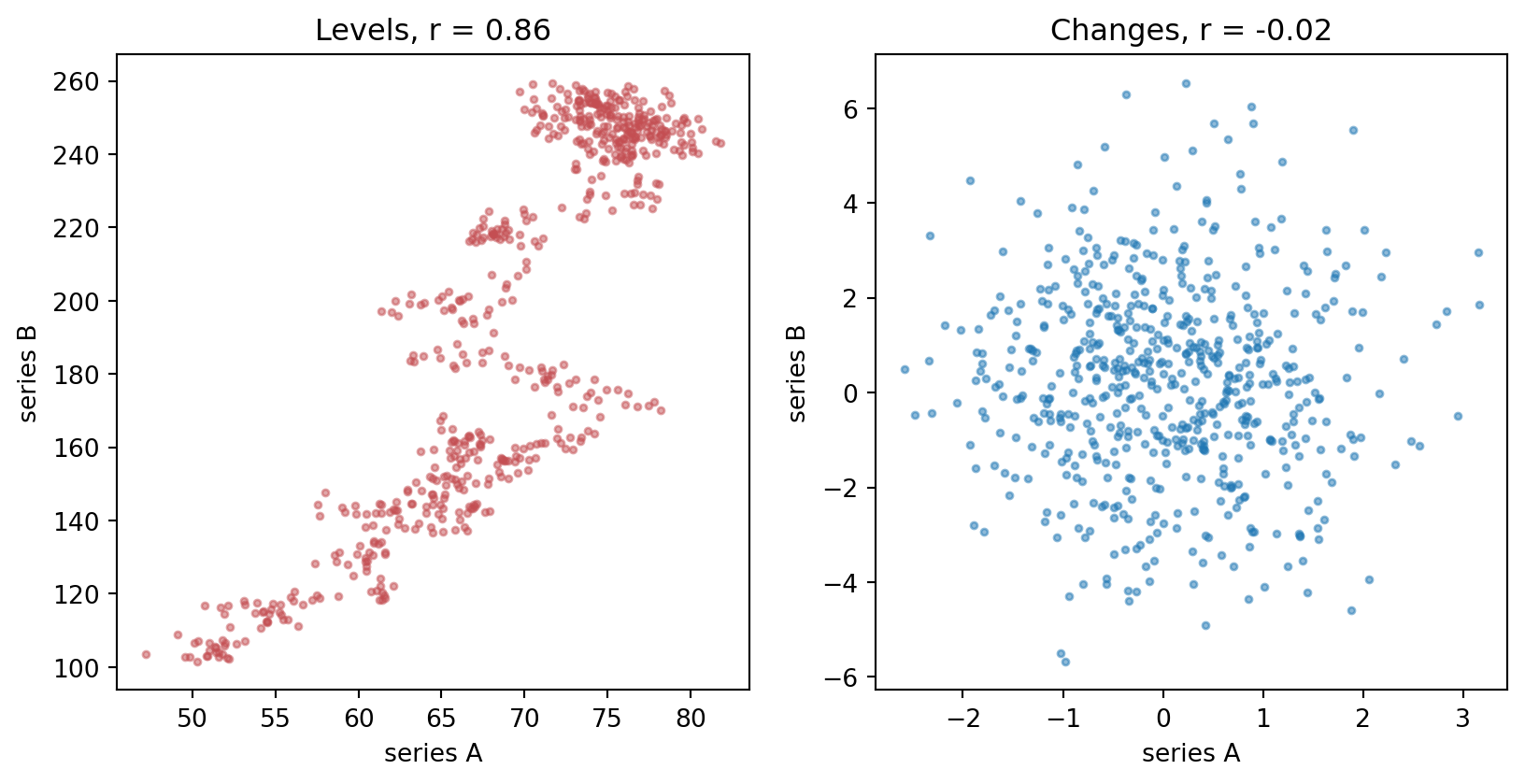
Say we have two price series and, in truth, nothing connects them. I build each one separately, and I give each one an upward drift, so both of them rise over the period. If we now compute the correlation of the two price levels, a number between −1 and 1 that measures how closely they move together, we get 0.86.
So, the issue is that, not accounting for the upward trend in each series (spurious correlation), we falsely believe that the two series are related. The 0.86 only measures that both series rise over the period.
Each series adds a fixed drift and its own noise every period, over 600 periods, so the changes from one period to the next share no trend, while the levels both rise.
Show the code
rng = np.random.default_rng(2)NUMBER_OF_PERIODS =600# Each series is a random walk with drift. Every period it takes a step, and the step is a# fixed drift plus that period's own noise. cumsum adds the steps up, so the level wanders# upward. The two sets of steps are drawn separately, so nothing connects them.steps_a =0.10+ rng.normal(0, 1.0, NUMBER_OF_PERIODS) # its own drift and noisesteps_b =0.30+ rng.normal(0, 2.0, NUMBER_OF_PERIODS) # drawn separately from series Aseries_a =50+ np.cumsum(steps_a) # the level of series A, starting at 50series_b =100+ np.cumsum(steps_b) # the level of series B, starting at 100# np.diff subtracts each value from the next, leaving the change from one period to the# next. A change does not trend upward the way a level does, so a correlation of the changes has# no shared trend to pick up.changes_a = np.diff(series_a)changes_b = np.diff(series_b)# corrcoef returns a 2x2 table of every pair, so the number wanted is off the diagonallevels_correlation = np.corrcoef(series_a, series_b)[0, 1]changes_correlation = np.corrcoef(changes_a, changes_b)[0, 1]print(f"levels r = {levels_correlation:.2f}, changes r = {changes_correlation:.2f}")# subplots(1, 2) returns the two panels together, and unpacking them names each onefig, (levels_panel, changes_panel) = plt.subplots(1, 2, figsize=(10, 4.6))levels_panel.scatter(series_a, series_b, s=7, color=RED, alpha=0.5)levels_panel.set_title(f"Levels, r = {levels_correlation:.2f}", fontsize=12)changes_panel.scatter(changes_a, changes_b, s=7, color=TEAL, alpha=0.5)changes_panel.set_title(f"Changes, r = {changes_correlation:.2f}", fontsize=12)for panel in (levels_panel, changes_panel): panel.set_xlabel("series A") panel.set_ylabel("series B") style_chart(fig, panel)plt.show()
levels r = 0.86, changes r = -0.02
The left panel plots the two price levels against each other, and the right panel plots their changes from one period to the next. The correlation of the changes is -0.02, against 0.86 for the levels.
Safeguard. Start with the economics: ask whether there is any reason the two series should be related, because no test supplies that reason. Then correlate the changes, not the levels, or use a cointegration test, which checks whether a combination of the two trending series stays close to a fixed level.
3. Confirmation bias
The next three biases come from searching for a result, and the first of them adjusts one strategy until its Sharpe ratio looks good.
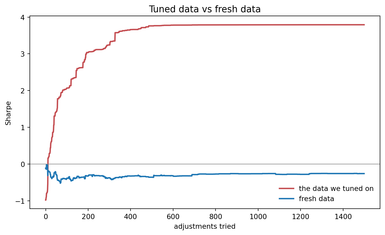
Say we have a strategy that holds thirty assets and, in truth, none of them can be predicted. The first test gives a weak Sharpe ratio, the average return divided by the standard deviation of the returns, in yearly terms. So we change the weight of one asset, test again on the same data and keep the change if the Sharpe ratio improves. If we now make fifteen hundred such changes, we get a Sharpe ratio of 3.79.
So, the issue is that, keeping only the changes that improve the Sharpe ratio (confirmation bias), we falsely believe that we have a strategy with a Sharpe ratio of 3.79. When we run the same strategy on data that the tuning has never seen, the Sharpe ratio is -0.26.
The thirty assets have daily returns drawn with a mean of zero and a standard deviation of 1%, independently of each other and of the past: three years to tune on, and ten fresh years drawn the same way. Each adjustment adds a normal draw with a standard deviation of 0.25 to the weight of one asset chosen at random.
Show the code
rng = np.random.default_rng(3)NUMBER_OF_ASSETS =30NUMBER_OF_ADJUSTMENTS =1500# Two separate draws from the same process, both centred on zero, so in truth none of the# thirty assets can be predicted and no set of weights has an edge.tuned_on_returns = rng.normal(0, 0.01, (3* D, NUMBER_OF_ASSETS)) # the data we tune onfresh_returns = rng.normal(0, 0.01, (10* D, NUMBER_OF_ASSETS)) # data the tuning never sees# The strategy starts with everything in one asset, chosen at randomweights = np.zeros(NUMBER_OF_ASSETS)weights[rng.integers(NUMBER_OF_ASSETS)] =1.0# The @ operator multiplies the table of daily returns by the vector of weights, which# leaves one portfolio return per day, and that is what the Sharpe ratio is measured on.best_sharpe = sharpe(tuned_on_returns @ weights)tuned_path = []fresh_path = []# The loop is the search itself, so it is written out step by step. Each pass adjusts one# asset at random, keeps the adjustment only when the Sharpe ratio on the tuning data# improves, and then records the Sharpe ratio of the strategy on both sets of data.for _ inrange(NUMBER_OF_ADJUSTMENTS): asset_to_change = rng.integers(NUMBER_OF_ASSETS) trial_weights = weights.copy() # a copy, so a rejected trial leaves nothing behind trial_weights[asset_to_change] += rng.normal(0, 0.25) trial_sharpe = sharpe(tuned_on_returns @ trial_weights)if trial_sharpe > best_sharpe: weights = trial_weights best_sharpe = trial_sharpe tuned_path.append(best_sharpe) fresh_path.append(sharpe(fresh_returns @ weights))print(f"tuned Sharpe ratio {tuned_path[-1]:.2f}, fresh Sharpe ratio {fresh_path[-1]:.2f}")fig, ax = plt.subplots(figsize=(9, 5))ax.plot(tuned_path, color=RED, lw=2.0, label="the data we tuned on")ax.plot(fresh_path, color=TEAL, lw=2.0, label="fresh data")ax.axhline(0, color=GREY, lw=0.8)ax.set_xlabel("adjustments tried")ax.set_ylabel("Sharpe ratio")ax.set_title("Tuned data vs fresh data", fontsize=13)ax.legend(frameon=False)style_chart(fig, ax)plt.show()
tuned Sharpe ratio 3.79, fresh Sharpe ratio -0.26
The red line is the Sharpe ratio on the data we tuned on. The red line never decreases, because we keep a change only when it raises that Sharpe ratio. The teal line is the same strategy’s Sharpe ratio on fresh data. The loop does not train a model, and every change is random. So the overfitting, which means fitting the noise in the data we tuned on, comes only from choosing which changes to keep.
Safeguard. Before the test, write down what result would make us drop the idea. Count every change we make along the way. And keep a part of the data that none of those changes has touched, because a Sharpe ratio measured on that part is the only one the adjustments have not affected.
4. Cherry picking
The bias above came from adjusting one strategy until its Sharpe ratio looked good. The next one comes from running many strategies and reporting only one.
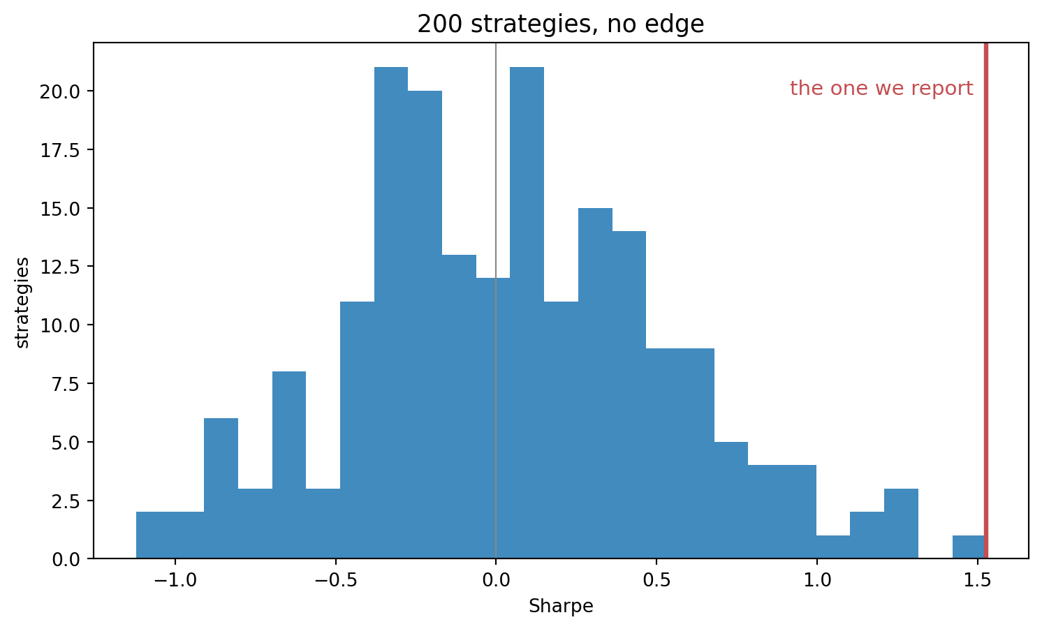
Say we build two hundred versions of a strategy and, in truth, none of them has an edge, an expected profit. If we now take whichever version had the highest Sharpe ratio, we get a Sharpe ratio of 1.53, against an average across all two hundred of 0.04.
So, the issue is that, reporting only the best of the two hundred versions (cherry picking), we falsely believe that we have a strategy with a Sharpe ratio of 1.53. The 1.53 comes from picking the highest number out of two hundred versions, and the more versions we test, the higher that number tends to be. Each version’s daily return is drawn with a mean of zero and a standard deviation of 1% over five years, independently across versions and days, so every version’s true Sharpe ratio is zero.
Show the code
rng = np.random.default_rng(4)NUMBER_OF_VERSIONS =200# One column is one version of the strategy and one row is one day. Every column comes from# the same process, centred on zero, so no version has an edge.version_returns = rng.normal(0, 0.01, (5* D, NUMBER_OF_VERSIONS))# Start with an empty list, work along the columns, and collect one Sharpe ratio per versionsharpe_of_each = []for version inrange(NUMBER_OF_VERSIONS): one_version = version_returns[:, version] # every day of a single column sharpe_of_each.append(sharpe(one_version))sharpe_ratios = np.array(sharpe_of_each) # an array, because .max() and .mean() come nextbest_sharpe_ratio = sharpe_ratios.max()average_sharpe_ratio = sharpe_ratios.mean()print(f"best {best_sharpe_ratio:.2f}, average {average_sharpe_ratio:.2f}")fig, ax = plt.subplots(figsize=(9, 5))ax.hist(sharpe_ratios, bins=25, color=TEAL, alpha=0.85)ax.axvline(best_sharpe_ratio, color=RED, lw=2.4)# get_ylim reports the bottom and the top of the y-axis, and the label is near the topbottom_of_chart, top_of_chart = ax.get_ylim()ax.text(best_sharpe_ratio -0.04, top_of_chart *0.9, "the version we report", ha="right", color=RED, fontsize=11)ax.axvline(0, color=GREY, lw=0.8)ax.set_xlabel("Sharpe ratio")ax.set_ylabel("versions")ax.set_title("200 versions, no edge", fontsize=13)style_chart(fig, ax)plt.show()
best 1.53, average 0.04
The histogram shows the two hundred Sharpe ratios, one per version, centred on zero, the truth I built in. The red line marks the version we would have reported, with a Sharpe ratio of 1.53.
Safeguard. Count every version we test, including the ones we throw away, because luck alone raises the best of many versions. Before we trust the best version, work out the Sharpe ratio that the best of that many worthless versions produces, and trust the best version only if its Sharpe ratio is far above that number. Bailey and López de Prado (2014) turn this comparison into a formula, the deflated Sharpe ratio.
5. Regression to the mean
Selecting the best of many also causes the next bias, once we follow the selected ones forward in time.
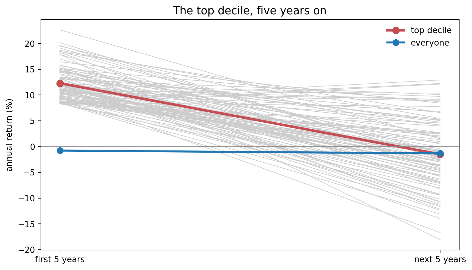
Say we have a thousand fund managers and, in truth, every one of them has the same skill, which is none. We rank them on their returns over the first five years and keep the top decile, the best tenth, who returned 12.3% a year. If we now follow those same managers through the next five years, they return -1.5% a year on average.
So, the issue is that, treating the strong record as skill (ignoring regression to the mean), we falsely believe that the top decile will keep returning 12.3% a year. Regression to the mean is the tendency of an extreme result that owes something to luck to be followed by a less extreme one. Here every manager’s daily return is drawn with a mean of zero and a standard deviation of 1% in both periods, independently across managers, days and periods, so the ranking is pure luck and says nothing about the next five years. In real data, a record mixes skill and luck, and luck is still part of why a manager ranks at the top.
Show the code
rng = np.random.default_rng(5)NUMBER_OF_MANAGERS =1000DAYS_IN_PERIOD =5* D # five years of trading daysdef yearly_return_over_five_years(daily_returns):"""Turn five years of daily returns into one average yearly return, in percent. prod multiplies the daily gross returns down each column, which gives the total growth of one manager over the whole five years. Raising that total to the power 0.2 takes the fifth root, which is the average year, and removing the 1 leaves the return. """ total_growth = (1+ daily_returns).prod(axis=0) average_year = total_growth **0.2return (average_year -1) *100# In truth every manager has the same skill, which is none, so the two periods are drawn# from the same process and the second one is independent of the first.first_period_daily = rng.normal(0, 0.01, (DAYS_IN_PERIOD, NUMBER_OF_MANAGERS))next_period_daily = rng.normal(0, 0.01, (DAYS_IN_PERIOD, NUMBER_OF_MANAGERS))first_period_return = yearly_return_over_five_years(first_period_daily)next_period_return = yearly_return_over_five_years(next_period_daily)# percentile finds the level that nine tenths of the managers are below, so the comparison# marks the top decile on the first period alone.top_decile_cutoff = np.percentile(first_period_return, 90)in_top_decile = first_period_return >= top_decile_cutofftop_decile_first = first_period_return[in_top_decile].mean()top_decile_next = next_period_return[in_top_decile].mean()print(f"top decile {top_decile_first:+.1f}% then {top_decile_next:+.1f}%")fig, ax = plt.subplots(figsize=(9, 5))for manager in np.where(in_top_decile)[0]: # one grey line per manager in the top decile ax.plot([0, 1], [first_period_return[manager], next_period_return[manager]], color=GREY, lw=0.7, alpha=0.5)ax.plot([0, 1], [top_decile_first, top_decile_next], color=RED, lw=3, marker="o", ms=8, label="top decile")ax.plot([0, 1], [first_period_return.mean(), next_period_return.mean()], color=TEAL, lw=2.4, marker="o", ms=7, label="all managers")ax.axhline(0, color=GREY, lw=0.8)ax.set_xticks([0, 1])ax.set_xticklabels(["first 5 years", "next 5 years"])ax.set_ylabel("yearly return (%)")ax.set_title("The top decile, five years on", fontsize=13)ax.legend(frameon=False)style_chart(fig, ax)plt.show()
top decile +12.3% then -1.5%
Each grey line is one manager from the top decile. The grey lines start bunched together at the top, because that is how they were chosen, and their returns over the next five years cover the whole range. The red line is the top decile’s average, 12.3% a year and then -1.5%, and the teal line is the average of all managers. So, over the next five years the top decile’s average is close to the average of all managers.
Safeguard. When a strong record turns weak, first work out what plain luck would have produced. Look for a reason only if the decrease is larger than luck would produce.
6. Outcome bias
The five biases above made a worthless result look valuable. The last one throws away a strategy that should have been kept.
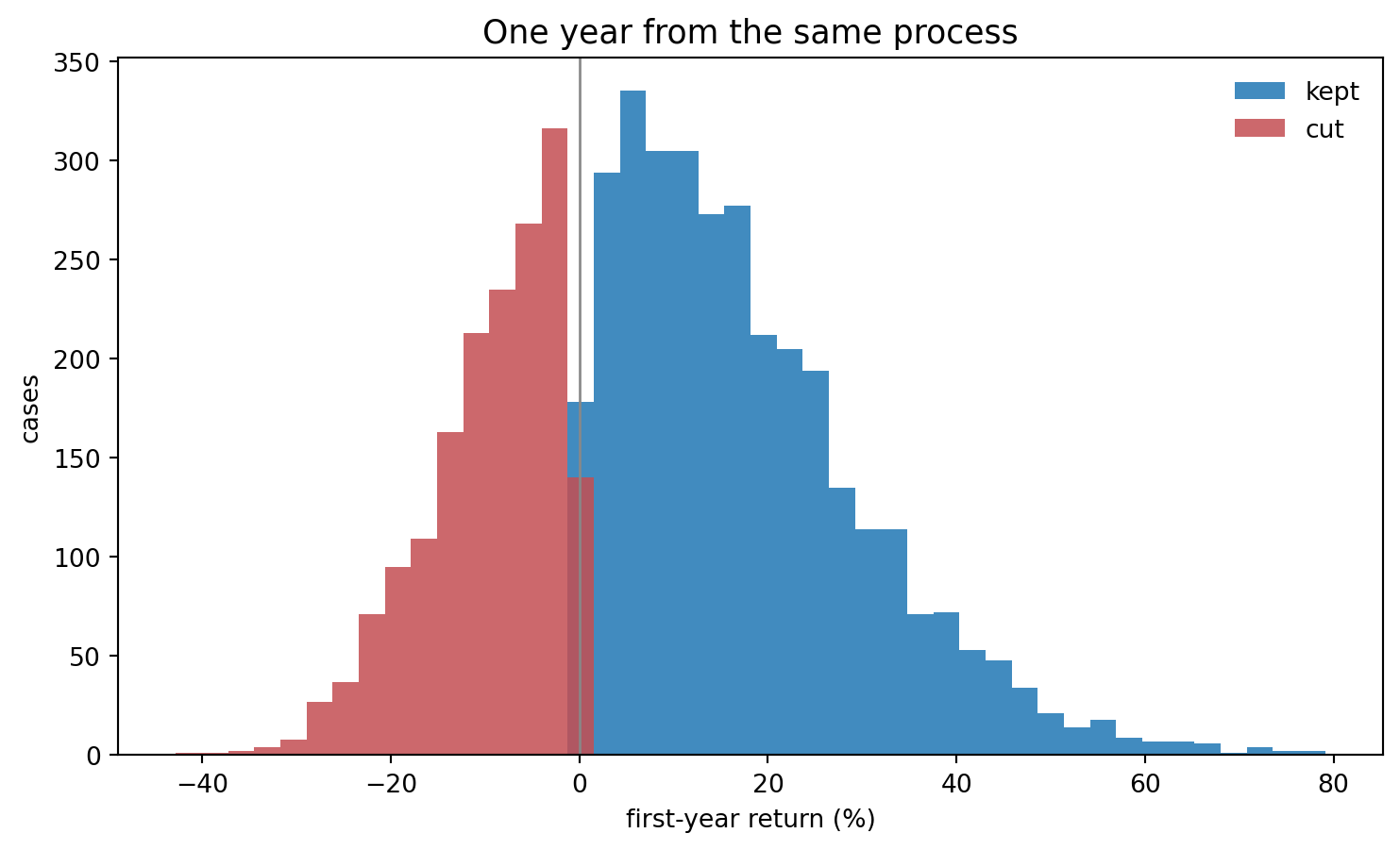
Say we have a strategy that makes money on average, at a Sharpe ratio of 0.5, so in truth the right decision is to keep trading it. We do not know the true Sharpe ratio yet, so we give the strategy one year and judge it on that year’s return. If we now simulate five thousand separate first years for this same strategy, a third of them lose money.
So, the issue is that, stopping the strategy because its first year lost money (outcome bias), we falsely believe we have removed a bad strategy. All five thousand of those years came from the same strategy, with the same edge and the same risk, and chance is the only thing that separates a winning year from a losing one. Baron and Hershey (1988) found that people rate identical decisions more favourably once they learn the outcome was favourable.
The Sharpe ratio is the average daily return, the drift, divided by the standard deviation of daily returns, the daily volatility, times \(\sqrt{252}\). With a daily volatility of \(\sigma = 1\%\), a Sharpe ratio of 0.5 therefore needs a daily drift of \(\mu = 0.5 \times \sigma/\sqrt{252} = 0.0315\%\). Each daily return is drawn with that mean and that standard deviation.
Show the code
rng = np.random.default_rng(6)TRUE_SHARPE =0.5STRATEGY_VOLATILITY =0.01NUMBER_OF_FIRST_YEARS =5000# A Sharpe ratio is the drift divided by the volatility and scaled by the square root of# the trading days in a year. Running that backwards gives the daily drift a strategy needs# in order to have a true Sharpe ratio of 0.5.daily_drift = TRUE_SHARPE * STRATEGY_VOLATILITY / np.sqrt(D)# Five thousand separate first years, every one of them from this same strategy. One column# is one year, and prod multiplies its daily gross returns together.daily_returns_by_year = rng.normal(daily_drift, STRATEGY_VOLATILITY, (D, NUMBER_OF_FIRST_YEARS))year_growth = (1+ daily_returns_by_year).prod(axis=0)first_year_return = (year_growth -1) *100ended_down = first_year_return <0print(f"{ended_down.mean() *100:.0f}% of first years end down")fig, ax = plt.subplots(figsize=(9, 5))# One set of bin edges for both histograms, so the two colours are on the same scalebins = np.linspace(first_year_return.min(), first_year_return.max(), 45)kept_years = first_year_return[~ended_down]cut_years = first_year_return[ended_down]ax.hist(kept_years, bins=bins, color=TEAL, alpha=0.85, label="kept")ax.hist(cut_years, bins=bins, color=RED, alpha=0.85, label="cut")ax.axvline(0, color=GREY, lw=1.0)ax.set_xlabel("first-year return (%)")ax.set_ylabel("cases")ax.set_title("One year from the same process", fontsize=13)ax.legend(frameon=False)style_chart(fig, ax)plt.show()
34% of first years end down
Every year counted in the chart, red and teal, is a first year from the same strategy. The red years are the years we would stop after, and a year is in the red group by chance alone. The sum of a year’s daily returns has a mean of 0.5 times its standard deviation. So the sum is negative with a probability of \(\Phi(-0.5) = 31\%\), where \(\Phi\) gives the probability that a standard normal draw is below a given value. Compounding lowers a year’s return a little, which brings the share to the 34% the simulation prints.
Safeguard. Keep a journal. Before the first year, write down what we believe about the strategy and what we expect it to return. After the year, compare the expectation with what happened, and ask whether a gap comes from randomness, as in the chart above, or from something that breaks the reasoning we wrote down. Without the journal, the outcome is the only thing left to judge.
Limitations
Simulated data shows the mechanism. Each market above was built so that I knew the answer before the test ran, so I can measure the bias. How large the same bias is in real data depends on the data, on how freely we search, and on how often we check a result.
The biases overlap. Confirmation bias and cherry picking are the same selection at two points: confirmation bias while building a strategy, and cherry picking while choosing which strategy to show. The six sections show the biases one at a time, and one decision can involve several of them.
Conclusion
Knowing the names does not remove the biases. We are present at every stage where these biases can enter: choosing the sample, defining the test, changing the model, and deciding what the result means.
Several of the safeguards above are about timing. We write something down before we see the result: the rule that would make us drop the idea, the count of the versions we test, and the journal with what we expect the strategy to return. Others compare the result with what luck alone produces: the best of two hundred worthless versions, the strong record that turns weak, and the first year that ends in a loss. And the safeguard for survivorship bias puts the stocks that stopped trading back into the data.
The takeaway is that the rules for dropping an idea, counting versions and judging a first year have to be written down before we see the result, because a rule chosen after seeing the result may already be influenced by the result.
Disclaimer: a teaching example on simulated data. Every number here comes from a market I built myself, where the truth was fixed before any test ran. Not investment advice.
Sources: Rolf Dobelli, The Art of Thinking Clearly, Harper, 2013, which prompted this post. Stephen Brown, William Goetzmann, Roger Ibbotson and Stephen Ross, Survivorship Bias in Performance Studies, Review of Financial Studies (1992). Clive Granger and Paul Newbold, Spurious Regressions in Econometrics, Journal of Econometrics (1974). Peter Wason, On the Failure to Eliminate Hypotheses in a Conceptual Task, Quarterly Journal of Experimental Psychology (1960). Tyler Shumway, The Delisting Bias in CRSP Data, Journal of Finance (1997). David Bailey and Marcos López de Prado, The Deflated Sharpe Ratio, Journal of Portfolio Management (2014). Jonathan Baron and John Hershey, Outcome Bias in Decision Evaluation (1988).